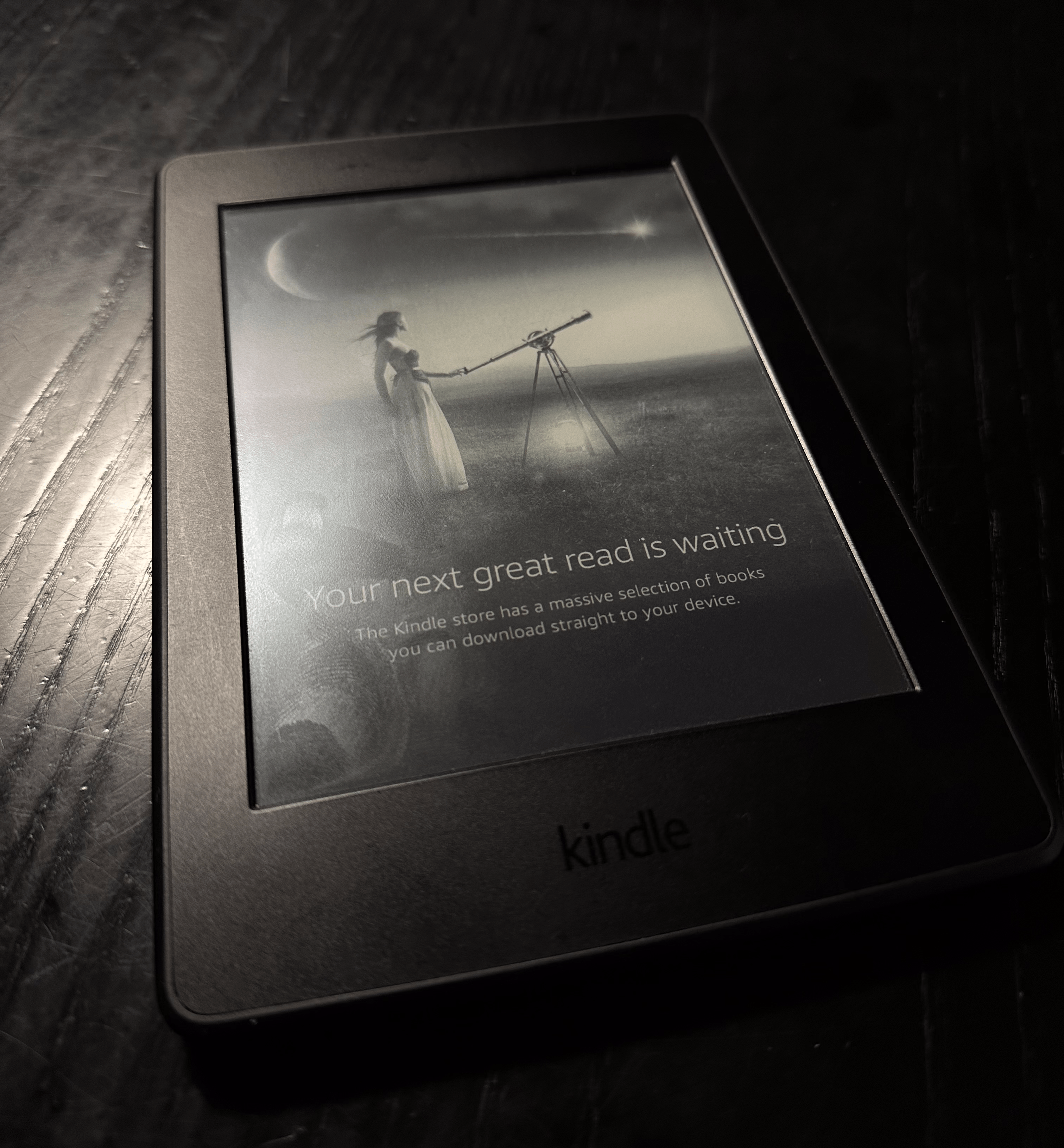
I’ve owned a Kindle Paperwhite since 2019 and have read more than a hundred books on it. Here’s what I would change if I were to design an eBook reader myself.
The idea for this post came to me after a heated conversation with my girlfriend about books, eBook readers, and the design of things.
There are many instances in my life where I use a product or service and have a lot of opinions about how it should be improved. In many cases, I even want to design/produce it myself because so many things are just off.
This happens to me everywhere in life, whether using a computer or when I want to buy a new pair of jeans. Things just aren’t how I want them to be. It’s usually the small details that make or break the product.
For example, I only use two pairs of the same jeans - because they’re perfect, and if I were to design my own, I wouldn’t change a thing.
I use my eBook reader almost daily. It works and gets the job done, but some of the design and software-related decisions just don’t make sense to me.

First, let me communicate what an eBook reader means to me. It’s a digital replacement for a book-reading experience. This means that you will have to sacrifice some of the positives of reading a physical copy, for an even better experience, that will hopefully make you read even more.
This is true in most cases. I can download a lot of books on it so I don’t have to bring so many physical books on vacation. There’s less friction to start reading a new book. I can highlight my books easier and everything else that comes with digital.
However, my Kindle does a really bad job of making you read more - or even be aware of the book you’re reading.
Let me tell you the positives of reading a physical copy. You see the cover - with usually beautiful cover art, title, and author. When you open a book, you have a feeling of progress in your hands - since you can see and feel the number of pages you’ve read. And physical books just smell nice.
On Kindle, the default “standby” screen is just a generic image with the text “Your next great read is waiting”. This makes no sense to me, why not use the book’s cover as the standby screen?
It has happened so many times that someone asked me which book I was reading and I had to check to answer because after a couple of hours of reading, you just forget if you aren’t constantly reminded every time you pick up the book.
In my opinion, the standby screen should also feature your progress in the book (visually displayed - not just percentages) and maybe even some kind of “daily streak” mechanics could be implemented to make you read more.
As mentioned, another amazing thing about physical books is the “feeling” of progress. This is something I don’t have, and miss the most, with Kindle. Having a physical feeling of progress when holding a book in hand is greatly encouraging to read another page and to finish it as soon as you reach the “critical” mass to “push” for a finish.
This is something Kindle doesn’t do well and it’s not just because it’s digital. The only indicator of progress on Kindle is the percentage at the bottom of the screen - which usually includes the sources and references as well. It has happened so many times that I’ve finished reading the main part of the book at 70 percent.
I would like to have some kind of visual progress, like a percentage-based bar at the top of the screen. This would at least give me some visual indicator of the progress. I would also like the percentages to be accurate based on the book’s main reading material. It makes no sense to include sources in the count.
I guess these are just small little details that I would change about my Kindle. That’s how I usually feel - the product is 80 or 90 percent there, but the details matter so much.
I wonder why designers and product managers at Amazon aren’t asking themselves more about the leftover gap of experience between physical and eBooks. Yes, Kindle does some things better than the physical book, but some basics still aren’t there.
I think the main point I’m trying to make is that we humans use tools. We should think deeply about how we design and create those tools. We should care about how we live our lives and we should “design” our tools and lifestyle by always questioning ourselves and trying to make things better, making products that we would be delighted to use.

